The client asked for branding and marketing materials for a new restaurant brand that serves all-in-one bowls with rice and Korean-style meat of choice. The materials include but are not limited to logos, menu design, wall graphics, bowl design, stickers, business cards, and social media advertisements.
This project is in process, following the timeline of the client.
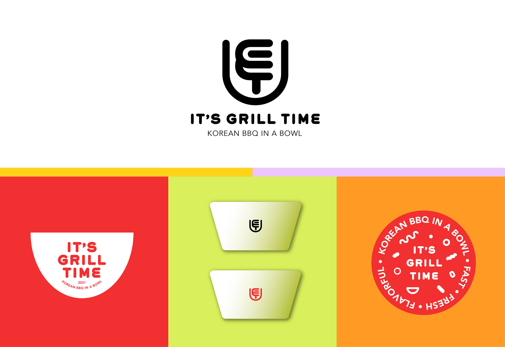
The logo consists of three elements: a bowl, letters G and T, and fire — three core elements to the restaurant. They are blended into an almost abstract shape, harmonizing and supporting each other.
I suggested three words that explain the brand: Fast, Fresh, and Flavorful. The graphics in this proposal show the bold lines and raw shapes that portray the transparent and straightforward value of the brand.
The name, It's Grill Time is used as a catchy phrase throughout the graphics to provide a friendly tone to the brand. The bright and solid color schemes endorse the casual, yet amiable mood.
Typeface: Grover Heavy/ Avenir Book
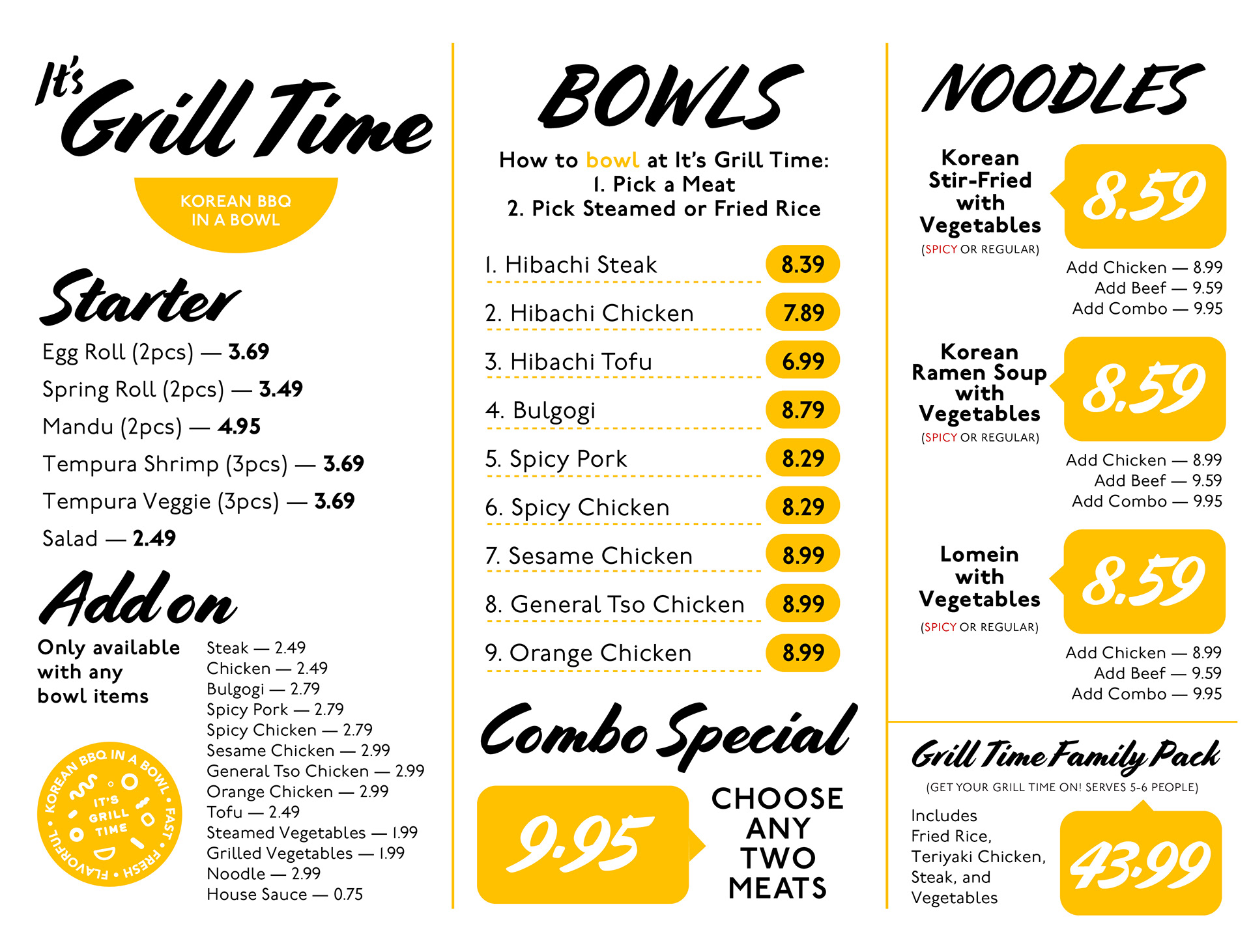
The bold and handwritten style of typeface that mimics the ink brush strokes emphasize the Asian culture of the brand. The color scheme compliments the light grey interior and draws the eye to important sections of the menu. Like the brand itself, the menu is simplified and categorized to serve one of the core values – fast.